Mint Design System
In 2024, PhonePe set out to redesign its app for 600M+ users on a six-month deadline, and nothing could ship until the design system did. Mint's foundation was rebuilt in six weeks, and every product team built on it from day one.
Industry
Fintech
Company
PhonePe
Role
Design Systems Lead
Year
2024-2025
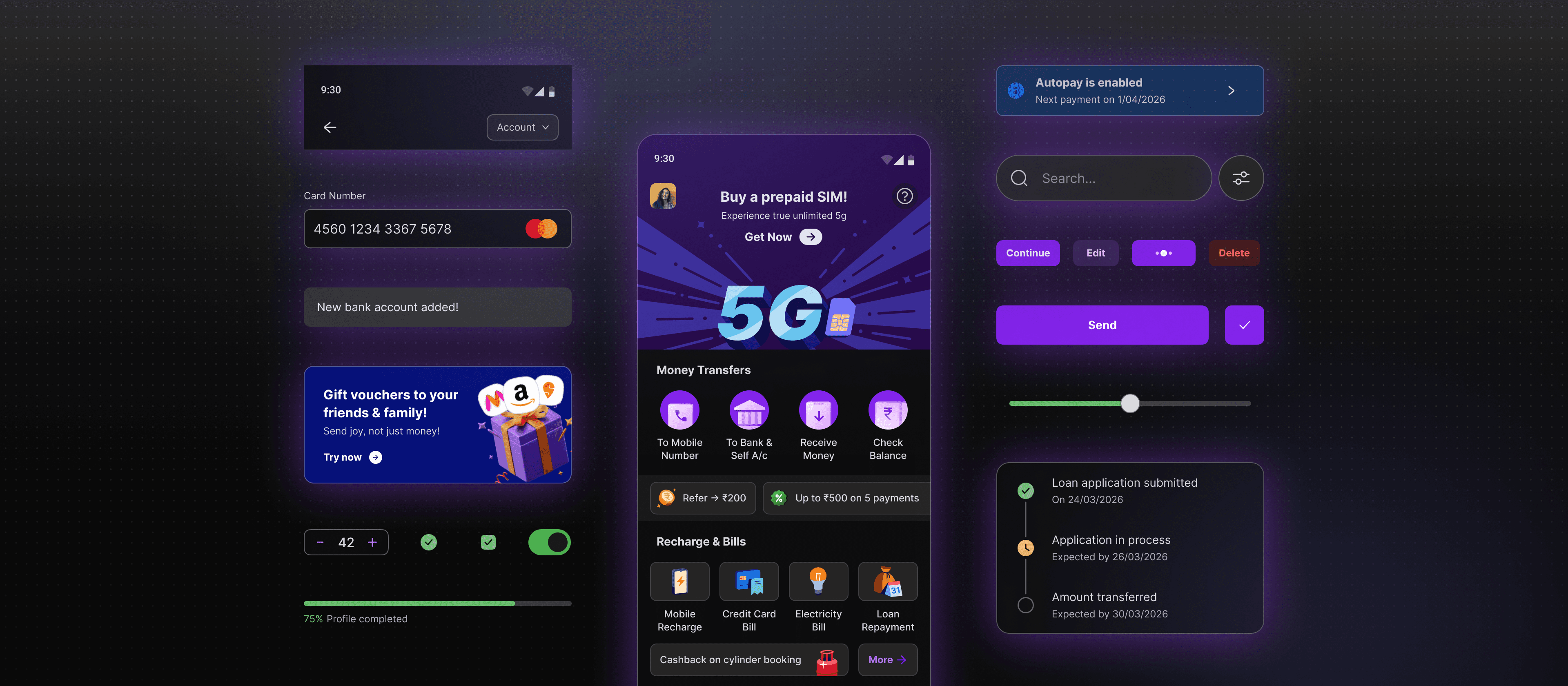
PhonePe (pronounced phone-pay), India's leading digital payments and financial services app, processes over $1.6 trillion in transactions a year. Every tap, payment confirmation, and error state in the consumer app runs through the design system. Mint gave the 25 designers and hundreds of engineers behind that app a shared language: native Figma Variables, a versioned token pipeline, and theming built to hold at that scale. Token adoption is enforced end to end. Nothing untokenised reaches production.
Why the existing system couldn't support the revamp
PhonePe already had a design system with a mature token architecture and a working code counterpart. But with the visual language changing from the ground up, components and styles needed to be rebuilt anyway. The revamp was the right moment to fix the workflow too, and we took it.
The old workflow ran entirely on Token Studio, a plugin designers had to operate alongside Figma just to apply colors, spacing, and corner radii. That meant onboarding overhead for every designer, slow performance against PhonePe's large token set, and one deeper problem: tokens had no presence in Figma itself, so raw values, hex codes and pixel numbers, became the default language between designers and developers.
Dark mode made that liability acute. Getting it right requires everyone speaking the same token language, and with raw values as the common currency, handoffs were error-prone and slow.
Key decisions
Moving fully to Figma Variables
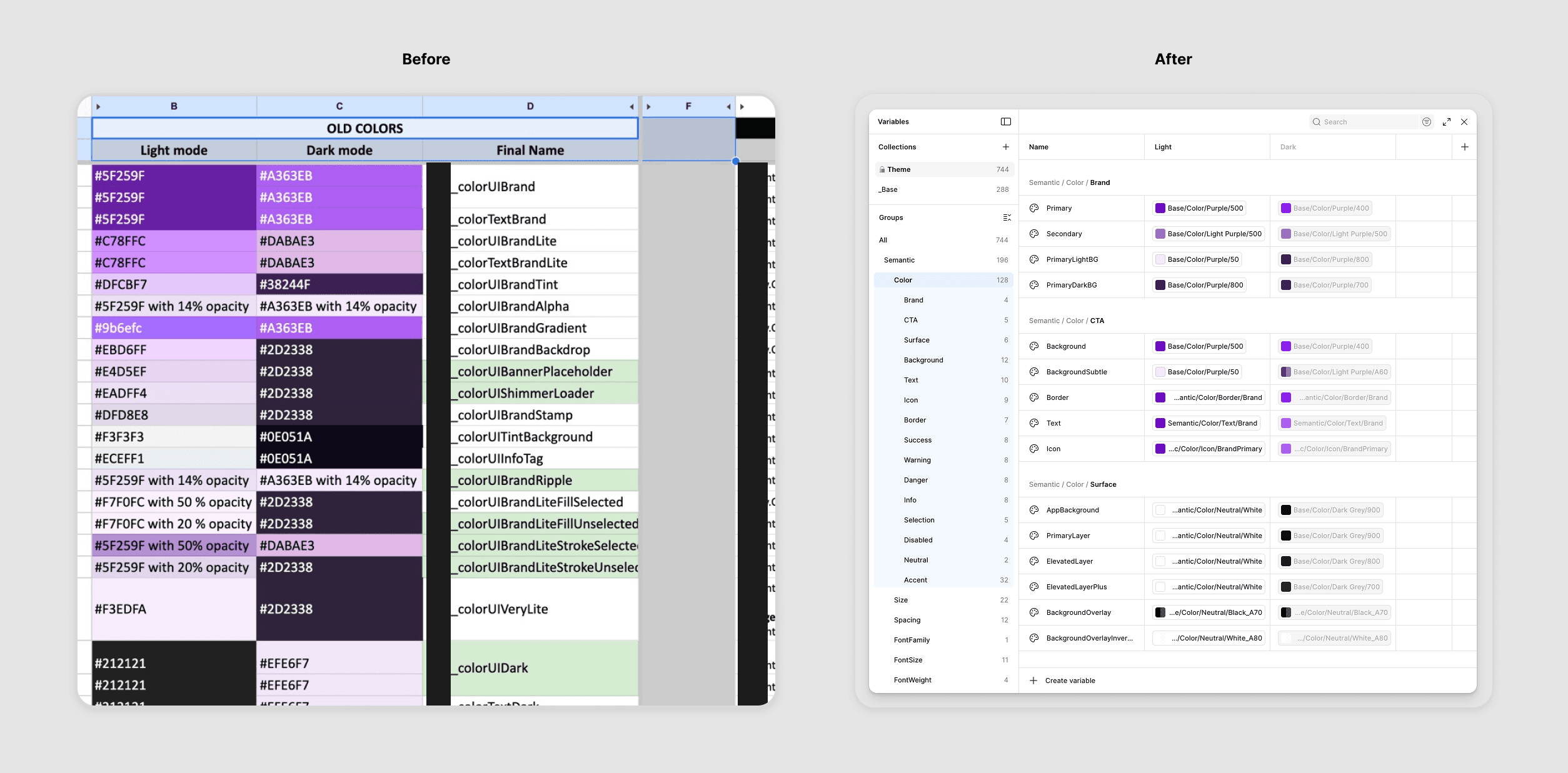
From manual color mapping spreadsheets to native Figma Variables: the token migration that changed how the team communicates
Migrating from Token Studio to native Figma Variables wasn't just a tooling preference. It collapsed the gap between how design and engineering communicate.
With Variables, tokens live inside Figma. Names are visible and searchable, designers apply them as part of their normal workflow, and when designers speak in token names, so do their handoffs to developers.
The migration itself took about a week, timed deliberately to the start of the revamp: the team was focused on new work, older files weren't active, and the clean slate meant legacy files never needed migrating.
Preserving the existing token architecture
One decision that could have gone differently: we didn't refactor the token architecture on the code side. The existing three-tier structure (base primitives → semantic → component) was already in production and working well for engineering, so we mirrored it in Figma Variables and kept both sides in sync, avoiding real refactoring cost for limited benefit.
Semantic tokens are meant to be generic and reusable, but feature teams have specific needs, and at PhonePe new features and campaigns ship constantly. Rather than dilute the semantic layer, we added a Features subgroup: a sandboxed layer that kept the core architecture clean while giving product teams a predictable place to work.
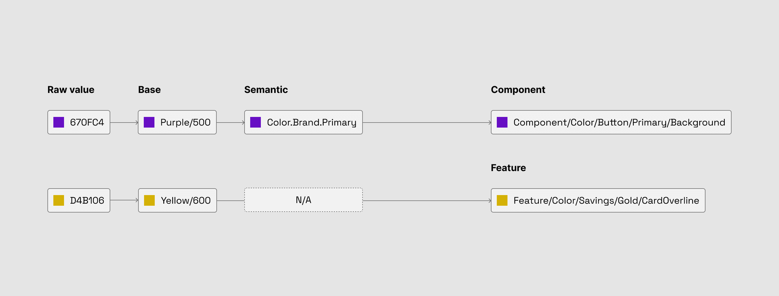
Mint's token architecture: a three-tier system with a dedicated feature layer for product-specific needs
Theming and dark mode via Variables
Dark mode existed before, but the new visual direction meant rebuilding it from scratch. Variables made that significantly faster: semantic tokens reference different primitive values per theme, so switching between light and dark became a single toggle rather than a manual re-application of values. More importantly, design and engineering now use the same semantic token names for both themes. The dark mode errors that came from raw-value communication largely disappeared.
A git-based token handoff
The old handoff was fragile by design: a JSON export from Token Studio, emailed to engineering, with no version history. With Variables, we adopted the DTCG standard, exported JSON from Figma, and versioned it in a dedicated GitLab repository with weekly commits and detailed changelogs.
The shift mattered beyond tidiness. Engineers consume tokens directly into their pipeline, changes are traceable, and trust between design and engineering around token accuracy went up noticeably.
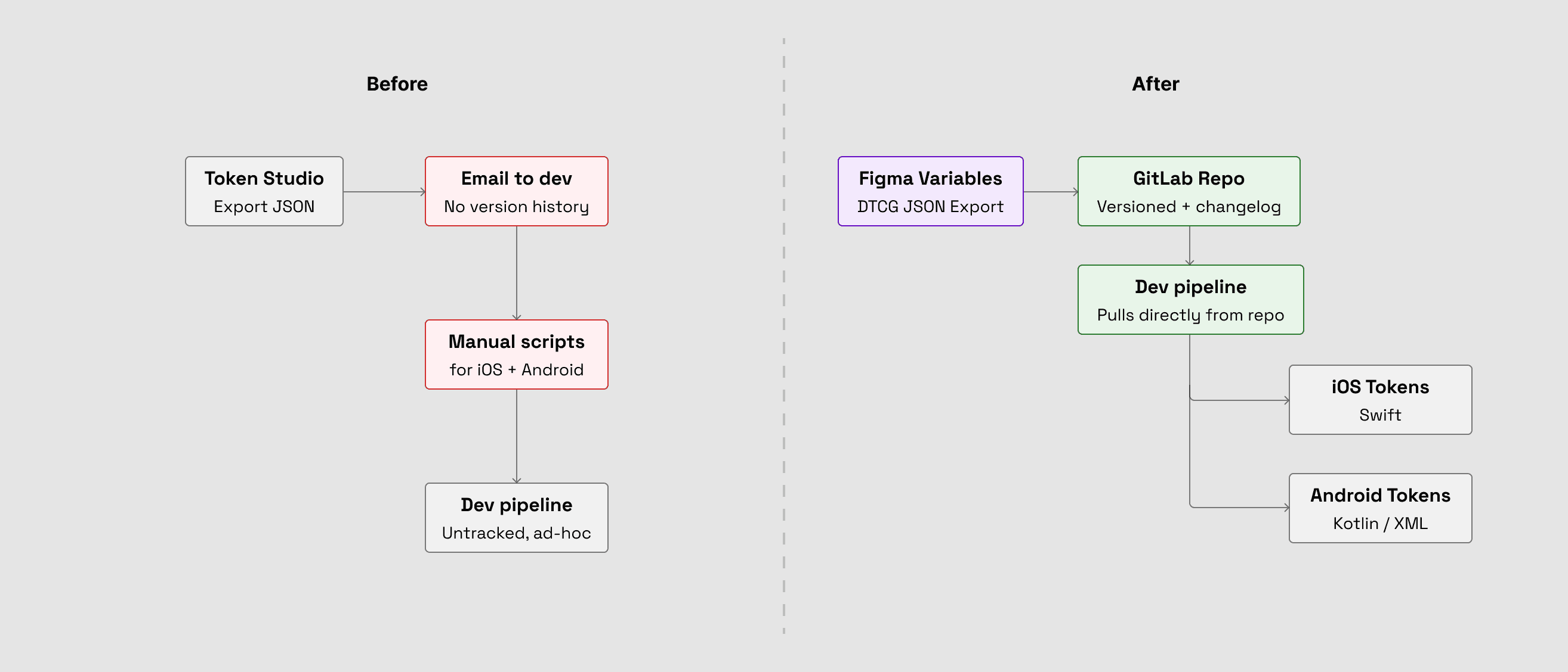
Token handoff before and after: from manual email transfers to a versioned GitLab pipeline
Making the system legible: Mint Docs
A design system is only as good as its adoption, and a Figma library plus a Slack channel wasn't going to be enough. Knowledge lived in scattered docs, email threads, and individual heads. So we built Mint Docs: a dedicated documentation site covering component usage, token guidelines, UI patterns, motion, and UX copy.
The intent wasn't comprehensiveness. It was making the system the path of least resistance, so using Mint correctly was always easier than working around it.
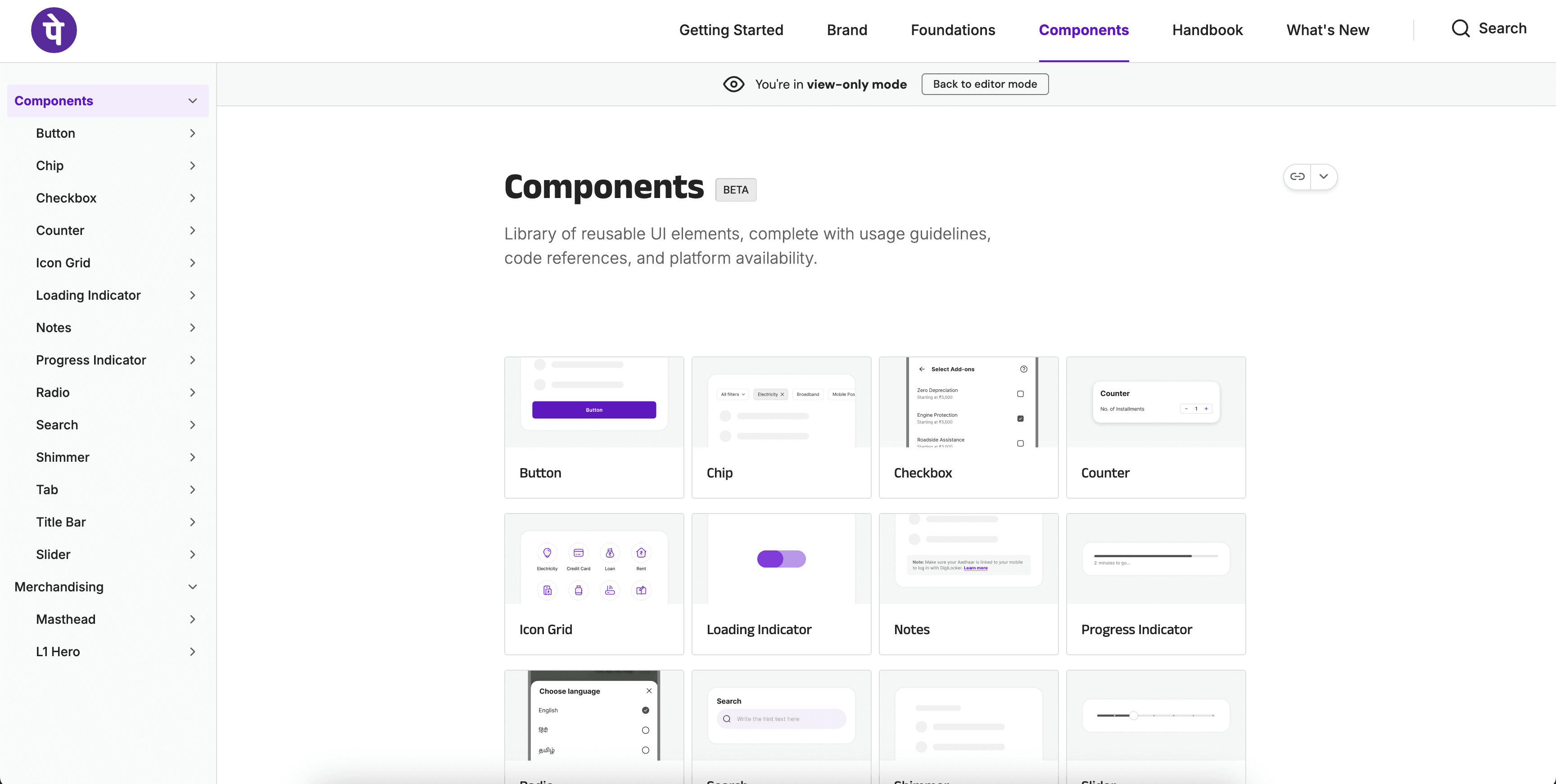
The components section of Mint Docs
Component spotlight
The Title Bar
The Title Bar lives on every screen, which means it has to work in every context: transparent backgrounds, image mastheads, dark and light surfaces, theme changes mid-scroll. Getting it wrong anywhere is immediately visible.
The core challenge was legibility over unpredictable backgrounds. We looked at the OS-native title bars first, but maintaining two platform versions in design and code would have broken consistency across the app, so we built custom. The answer to legibility was to stop trying to adapt dynamically and make the variants explicit instead: each of the six variants has a fixed icon and text treatment. The On Image variant always uses light icons in a dark container, legible regardless of what's underneath. No guessing, no runtime adaptation. Explicit variants were simpler to build, maintain, and consume than one adaptive variant trying to handle everything.
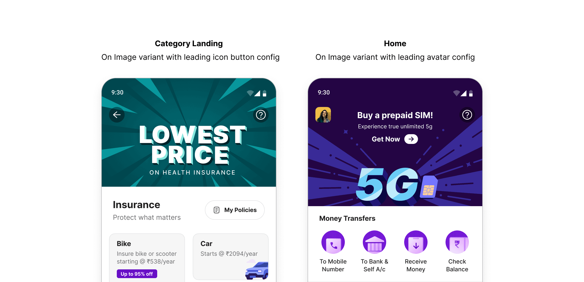
On Image variant in use: the dark icon container ensures legibility regardless of what's behind it
The On Scroll variant, built with the motion team, handles its own transparent-to-filled transition, removing the scroll choreography every screen used to rebuild. Naming was deliberate too: behaviour-based names like On Image and On Scroll meant designers and developers could pick the right variant without opening the documentation.
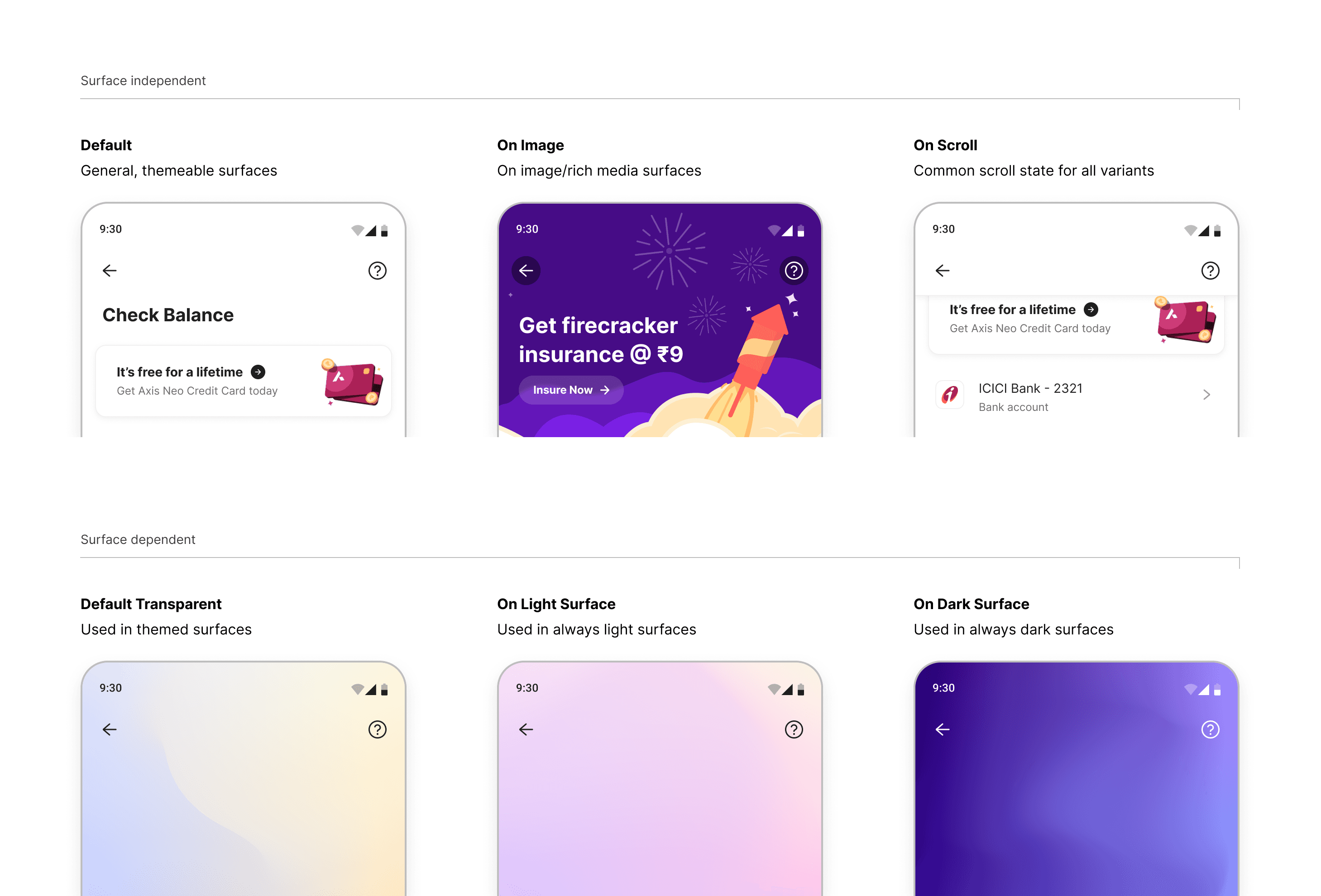
Title Bar variants grouped by surface type: three that adapt to any theme, three that are fixed to their surface
How it held up
Mint's foundation was the revamp's first deliverable, not a parallel workstream. The sequencing put early pressure on the DS team, but it gave every feature team a stable system before they started building.
Adoption is enforced at every stage: designers work within the token system and raise requests for gaps, and the DS team reviews and adds before handoff. Nothing untokenised reaches production. That norm was set during the revamp, when everyone built on Mint from day one.
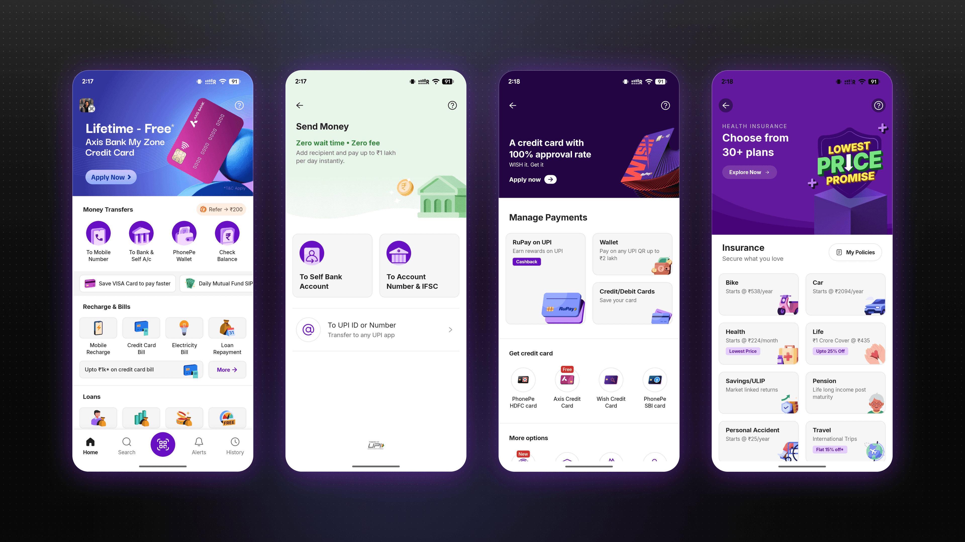
Mint components in the shipped PhonePe consumer app
Impact
50%
Reduction in time to implement a new screen or feature
100%
Token compliance across design and engineering
2x
Faster dark mode implementation after Variables migration
100%
Consumer product teams building on Mint by end of revamp
Reflection
If I were starting Mint from scratch today, I'd push for more architectural separation between the Figma token structure and the engineering implementation earlier in the process. Mirroring the existing code architecture was the right call for the revamp timeline. It kept refactoring cost down and got the system into production fast. But tighter coupling means changes on either side now require more coordination than they should. It's a tradeoff I'd make again given the constraints, but one I'd try to design out sooner on the next system.
The bigger lesson was about what actually drives adoption. The tooling decisions mattered, but what made Mint stick was the norm we established during the revamp: every feature built on the system from day one, with no exceptions. By the time the revamp shipped, Mint wasn't something teams used because they were asked to. It was just how PhonePe builds.
That shift in culture is what I'm most proud of. Mint established a shared practice and raised the floor of quality across every feature that followed. The system is still the foundation the consumer app is built on today.