GrabAds Platform
Generating a GrabAds performance report took days of manual work across scattered tools, overhead that was capping a growing revenue line. Within a larger 0-to-1 platform build, I designed the reporting experience that brought it down to hours, on demand.
Industry
AdTech / Enterprise SaaS
Company
Grab
Role
Senior Product Designer
Year
2021-2022
Some screens have been altered or obscured to respect client confidentiality.
Grab is Southeast Asia's largest super-app: rides, food delivery, payments, and, for the businesses on it, advertising. GrabAds was already a meaningful revenue stream, run largely on manual ops effort. The answer was a unified 0-to-1 ads management platform bringing campaign creation, targeting, and reporting into one product, envisioned as part of Grab's merchant portal, the suite of tools businesses on Grab use to manage their stores, orders, and advertising. I owned the reporting experience, working as part of the Obvious team alongside another product designer, with a separate sub-team on campaign management and targeting.
The problem with reporting
The ops team tracked campaign performance across Excel, Tableau, and a set of internal tools. There was no unified view: reports were assembled by hand and delivered as PDFs, with the delays, version confusion, and coordination overhead that implies. The immediate users were Grab's internal ops team, but the platform was designed with a longer horizon in mind: eventually, external advertisers would run campaigns themselves.
I came in with no prior AdTech experience. It mattered less than expected. At the product level, the problem was familiar: a workflow that had grown organically across too many tools, with no designed experience holding it together.
Key decisions
Establishing hierarchy in a data-heavy surface
The reporting dashboard was a 0-to-1 design problem: no existing product to work from, just ops workflows that had never been translated into a UI.

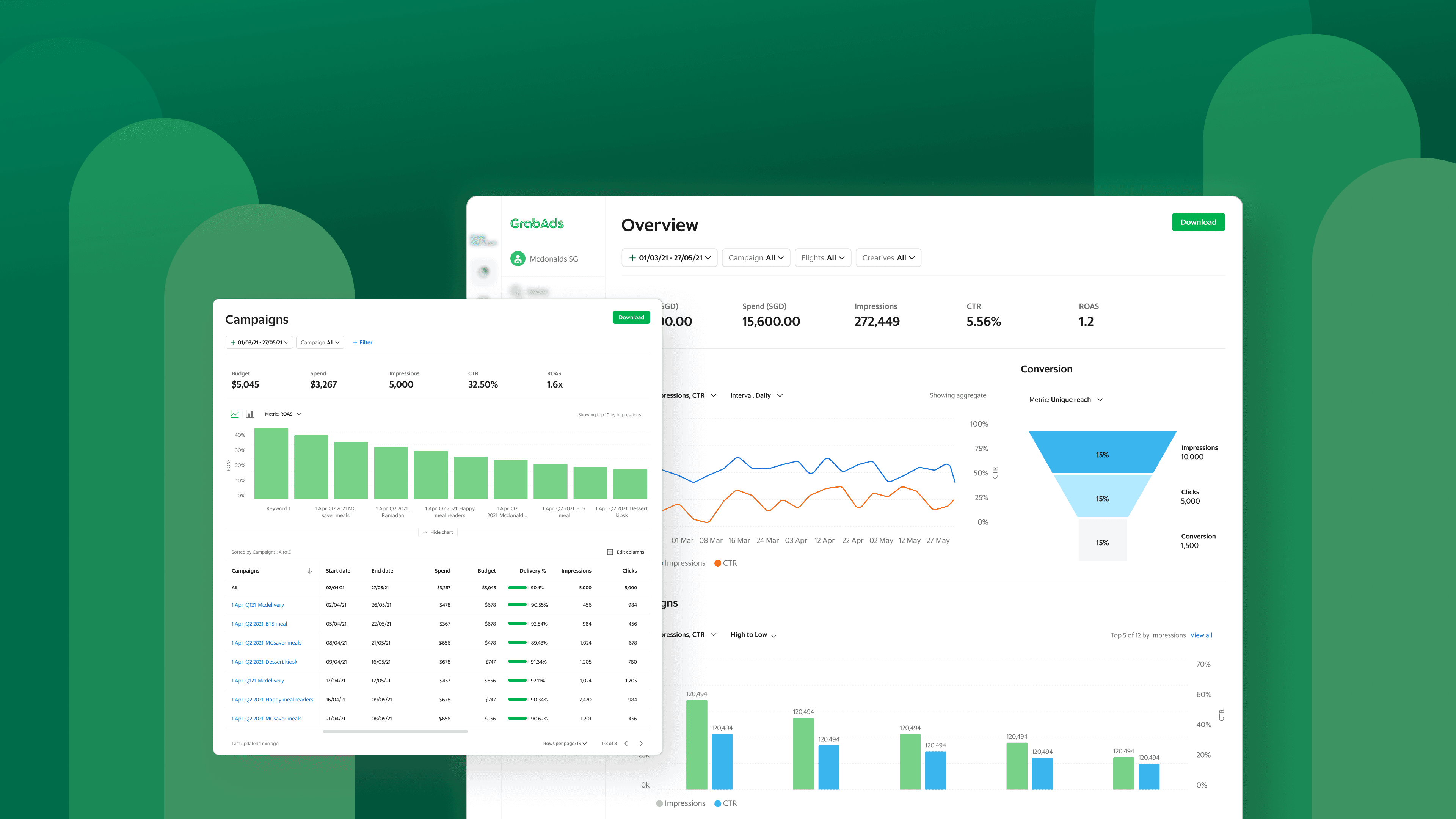
The Overview dashboard surfaces key metrics, trend data, and performance breakdowns across campaigns, flights, creatives, keywords, geo, and time, all in one view.
The core tension was completeness versus clarity. GrabAds tracked a large number of metrics and the ops team needed access to most of them, but surfacing everything at equal weight would produce a dashboard that required training to read, something a future self-serve product couldn't afford. So: primary metrics (reach, spend, conversion) always visible at the top level, secondary metrics behind a customisable view. Power users could reach the full data set without it overwhelming the default experience.
The hierarchy came out of early interviews with the ops team. Understanding which metrics they actually made decisions from, versus which they documented for compliance or clients, is what made the prioritisation possible.
Building for two audiences at once
Grab's internal ops team and future external advertisers cared about different things: granular data for internal reporting and client delivery on one side, a cleaner, more interpretive view of campaign performance on the other.

Advertisers can select and reorder dimensions and metrics to customise what appears in their report table, tailoring the view to what matters most for their campaign type.
Interviews with enterprise advertisers added a wrinkle: even self-serve advertisers wouldn't rely solely on GrabAds reporting. They were running campaigns across multiple platforms (Meta, Alibaba, Lazada) and consolidating their analytics externally. The platform didn't need to replace that workflow; it needed to fit into it. That insight produced the Download feature (PDF, Excel, CSV), letting advertisers pull GrabAds data into their own reporting stack without friction.
Rather than design for one audience and retrofit later, we built a configurable report builder: users select the metrics they want to see and shape their own view. One underlying product, adapting to both audiences. Reports became an on-demand output rather than a static PDF assembled by hand.
Filtering at two levels
Filtering shipped in two levels. Primary filters scope reports by campaign, flight, or creative, the baseline need for any reporting surface. Advanced filters are a conditional logic builder that lets ops teams slice high-volume data by metric, rule, and value.

A conditional logic filter builder lets ops teams slice high-volume data by metric, rule, and value, going beyond basic scoping to support deeper performance analysis.
The two levels do different jobs. Primary filters are navigation and focus. Advanced filters are analysis: finding underperforming segments, comparing spend against delivery, fine-tuning campaigns without leaving the platform. Both push toward the same goal: less reliance on manual exports and external tools, and a platform closer to genuinely self-serve.
One platform, not two features
The platform was built by two sub-teams, reporting on one side, campaign management on the other. The risk with parallel workstreams is a product that feels disjointed at the joins.

From any report table, users can view campaign details or jump directly into editing, keeping the workflow within the platform rather than switching between tools.
The mitigation was treating the connections between surfaces as a first-class design concern from the start. Every report table links directly to the relevant campaign, flight, or creative, so an ops team member looking at performance data can act on it immediately, without losing context or navigating back to a home screen. That took close coordination on information architecture, shared navigation patterns, and consistent labelling across both surfaces.
Validation and iteration
Designs were tested with Grab's ads ops team through prototype sessions. The overall response to the reporting UI was positive; the sessions earned their keep in the specifics.
Discoverability was the main friction point. Filters and column editing weren't prominent enough in the initial design, and users either missed them or took longer than expected to find them. Both were made more visible in a subsequent update. The summary cards at the top of each report also mattered more than expected, and the right defaults weren't universal: ops teams on food campaigns prioritised different metrics than those on non-food. The cards were updated to surface the most relevant metrics by campaign type.
One pattern confirmed the underlying structure: users moved through report levels in a consistent sequence, from campaigns down to flights and creatives. That validated the hierarchy the reporting structure was built around and informed how navigation between report types was refined in later iterations.
Outcome
The platform launched internally to Grab's ads ops team. Extending it to external advertisers was the planned next phase, and the report builder architecture was designed to support that without a structural rebuild.

Campaigns report and Overview dashboard
Days to Hours
Report generation moved from a multi-day manual process to on-demand, within the platform
One platform
Scattered spreadsheets, BI tools, and internal exports unified into a single product
Reflection
Coming into an unfamiliar domain on a tight timeline forced quick learning and ruthless prioritisation. The ops team interviews were the best investment of the project: without a clear picture of how they actually worked, the dashboard would have been shaped by assumptions about what an analytics product should look like rather than what this team needed.
The most grounding insight came from the enterprise advertiser research: self-serve didn't mean standalone. These advertisers were consolidating analytics across platforms externally, and designing for that reality, rather than assuming GrabAds reporting would replace their workflow, is what produced the Download feature.
Looking back, I'd have pushed harder on the visual design. Aligning with the merchant portal's visual language was the right call for the timeline, but there was likely room for a more considered, visually interesting direction than the safe path we took.
The broader lesson: on data-heavy products, structure is the design. Getting the information hierarchy right mattered more than any visual decision that followed.